Oracle
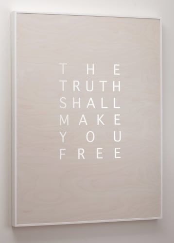
The present is great with the future, It furthers one to cross the great water, Abundance has success like the midday sun, The truth shall make you free …
These are some of the declarations that feature in this new body of text-based work created during the Covid 19 crisis. Backed by an ethereal, gently rhythmic sound track, the statements appear as patterned formations of text on brightly coloured fabric banners strung across the width of the gallery. They are also embedded into birch ply panels that shimmer with mirrored lettering and, on a far wall, come to life in a video projection that pulses with intensely coloured shapes and animated words. This is Oracle, a response to the precarity and uncertainty of our current times. It offers guidance in the form of declarations from Friedrich Leibniz, George Orwell, the Bible and the I Ching, and reflects a desire to know what the future holds and where destiny will lead us.
But the advice provided in Oracle is not easy to access, at least not at first glance. The statements may be bold, but they form patterns that have an almost code-like appearance, so the words are not always immediately visible and may require some effort to decipher. The Oracle has spoken, but its voice is not clear.
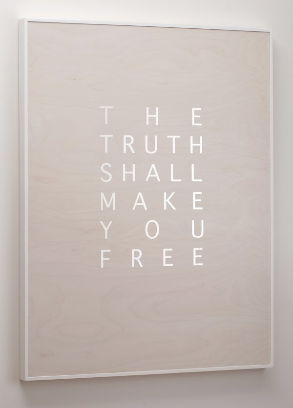
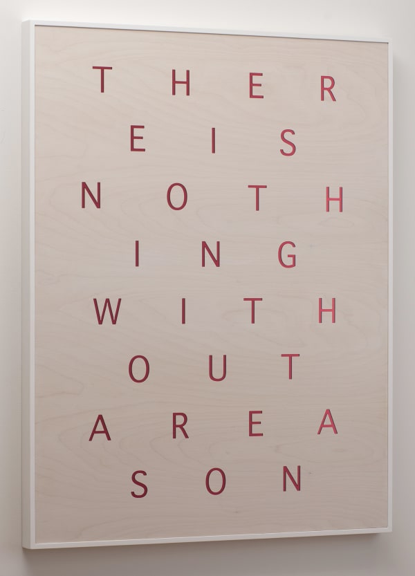
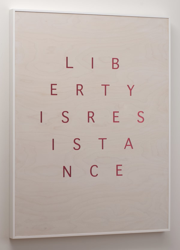
On the wooden panels, the letters spell out quotes from Orwell, Leibniz and the Bible. The messages here are more about the way things are, rather than how to take action in the face of uncertainty:
In the beginning was the word, There is nothing without a reason, Who controls the past controls the future…
The shiny, mirror-like letters seem to float against their wooden backgrounds and, as the materials are so vastly different, suggest a series of oppositions: the reflective versus the opaque, the inorganic versus the organic, and the culturally constructed versus the natural. But despite these juxtapositions, the marriage between the materials is seamless and reinforces the idea that opposites attract. The birch ply is a sea of waves and swirls and the letters are precise, metallic and machined, yet they coexist as if meant for each other, as if culture was intended to bed with nature. There is a suggestion here that destiny and predetermination go hand in hand.
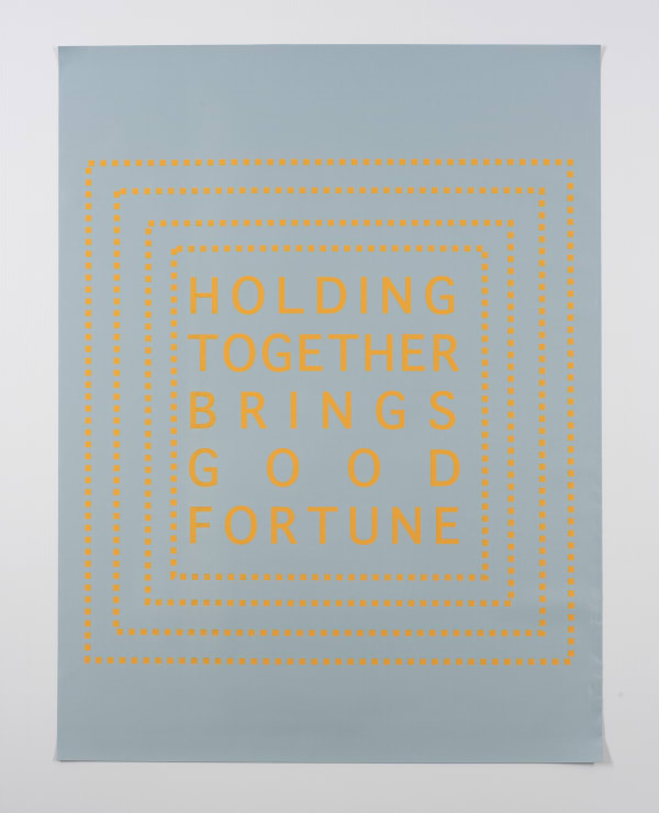
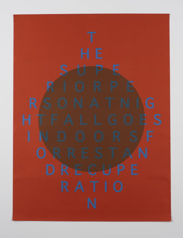
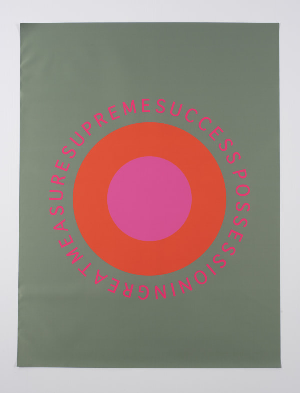
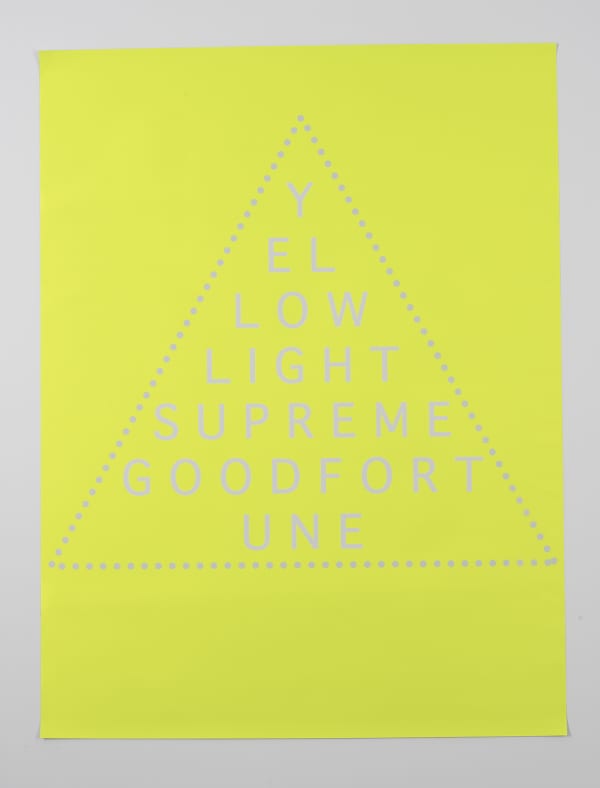
The fabric banners, on the other hand, are all about the juxtaposition and clash of colour rather than materiality, and convey a different take on our relationship to the future. In these works, all the text is from the I Ching, or Book of Changes, a three thousand year old ancient Chinese book of divinations that provides guidance about how to proceed in life, particularly in the face of difficulty:
Holding together brings good fortune, The perseverance of the woman furthers, The superior person at nightfall goes indoors for rest and recuperation…
While the birch panels make statements about the nature of the world and our relationship to it, the banners make pronouncements about what to do and what may result. They promise control over one’s destiny through positive action and almost beg to be hung from windows or balconies where their messages can become public declarations.
But, as with the wooden panels, the text on the banners is presented in code-like patterns that make it hard to read at first glance. This is made doubly difficult by the use of vivid, contrasting colour combinations – hot pink and red, bright orange and green, intense yellow set against luminous grey. Colour and pattern battle with the message for visual dominance. Once again there is the promise of meaning, but that meaning has been obscured, suggesting that wisdom is not something easy to come by – it requires effort and concentration.
The final element in the exhibition is the video that makes the banners come to life through a series of animations. Accompanied by an otherworldly sound track, letters fade in and out, spin in circles or pulse against vibrant background colours and shapes. The effect is mesmerising and, in homage to the Op Art movement of the 1960s, creates so many afterimages it is a challenge to focus for long. As with the panels and banners, meaning becomes entangled with visual perception.
Oracle is an extension of previous projects such as The Learning and Unity series of panels and digital prints, and the installations Graphos, Kryptos and A Tasmanian Reading Room, which all explore some aspect of the complex relationships between language, literature, philosophy and codification. Where Oracle differs is not just in its focus on the concepts of fate and divination, but in its striking use of lightness and bright colour. Most of the earlier work has leant towards the use of a dark palette, occasionally enlivened with red, gold or sepia to convey a sense of mystery and the unknown. These works have ventured into new territory, using pattern, colour, light and optical illusion to reflect a future that is precarious and uncertain, but also optimistic.
Brigita Ozolins
June 2020
-
 Brigita OzolinsTruth, 2020Birch ply, Liming white stain, stainless steel103 x 80 cmAU$ 5,500.00
 -
Brigita OzolinsThe present, 2020Birch ply, Liming white stain, stainless steel103 x 80 cmSold
-
Brigita OzolinsThe beginning , 2020Birch ply, Liming white stain, mirrored perspex103 x 80 cmSold
-
Brigita OzolinsRevolution, 2020Birch ply, Liming white stain, mirrored perspex103 x 80 cmAU$ 5,500.00
-
Brigita OzolinsReason, 2020Birch ply, Liming white stain, mirrored perspex103 x 80 cmAU$ 5,500.00
-
Brigita OzolinsReality, 2020Birch ply, Liming white stain, stainless steel103 x 80 cmSold
-
Brigita OzolinsLiberty, 2020Birch ply, Liming white stain, mirrored perspex103 x 80 cmSold
-
Brigita OzolinsEverything, 2020Birch ply, Liming white stain, stainless steel103 x 80 cmSold
-
Brigita OzolinsControl, 2020Birch ply, Liming white stain, mirrored perspex103 x 80 cmAU$ 5,500.00
-
Brigita OzolinsAbundance, 2020Silver backed polyester, stitching103 x 80 cmAU$ 1,200.00
-
Brigita OzolinsApproach, 2020Silver backed polyester, stitching103 x 80 cmAU$ 1,200.00
-
Brigita OzolinsDuration, 2020Silver backed polyester, stitching103 x 80 cmSold
-
Brigita OzolinsForgiveness, 2020Silver backed polyester, stitching103 x 80 cmSold
-
Brigita OzolinsHolding together, 2020Silver backed polyester, stitching103 x 80 cmAU$ 1,200.00
-
Brigita OzolinsNightfall, 2020Silver backed polyester, stitching103 x 80 cmAU$ 1,200.00
-
Brigita OzolinsPerseverance, 2020Silver backed polyester, stitching103 x 80 cmSold
-
Brigita OzolinsRevolution, 2020Silver backed polyester, stitching103 x 80 cmAU$ 1,200.00
-
Brigita OzolinsSupreme Success, 2020Silver backed polyester, stitching103 x 80 cmAU$ 1,200.00
-
Brigita OzolinsThe Lake, 2020Silver backed polyester, stitching103 x 80 cmAU$ 1,200.00
-
Brigita OzolinsWater, 2020Silver backed polyester, stitching103 x 80 cmAU$ 1,200.00
-
Brigita OzolinsYellow light, 2020Silver backed polyester, stitching103 x 80 cmAU$ 1,200.00